Creating a Fixed Top Menu in Web Design: A Complete Guide
-

- Chandra Sekar M
- 02-Aug-2024-05:40:34 PM
- Page Visitors : 71
Navigating through a website should be seamless and intuitive. One way to enhance user experience is by implementing a fixed top menu. This type of menu remains at the top of the screen as users scroll down, providing constant access to navigation links and improving the overall usability of your site.
A fixed top menu ensures that your visitors always have access to the main navigation links, no matter where they are on your page. This can be particularly useful for long-scrolling websites or pages with extensive content.
By keeping navigation options visible at all times, users can easily move between different sections of your site without having to scroll back to the top. This can lead to a more satisfying and efficient browsing experience.
With key navigation links always accessible, users are more likely to explore different parts of your website, leading to increased engagement and potentially higher conversion rates.
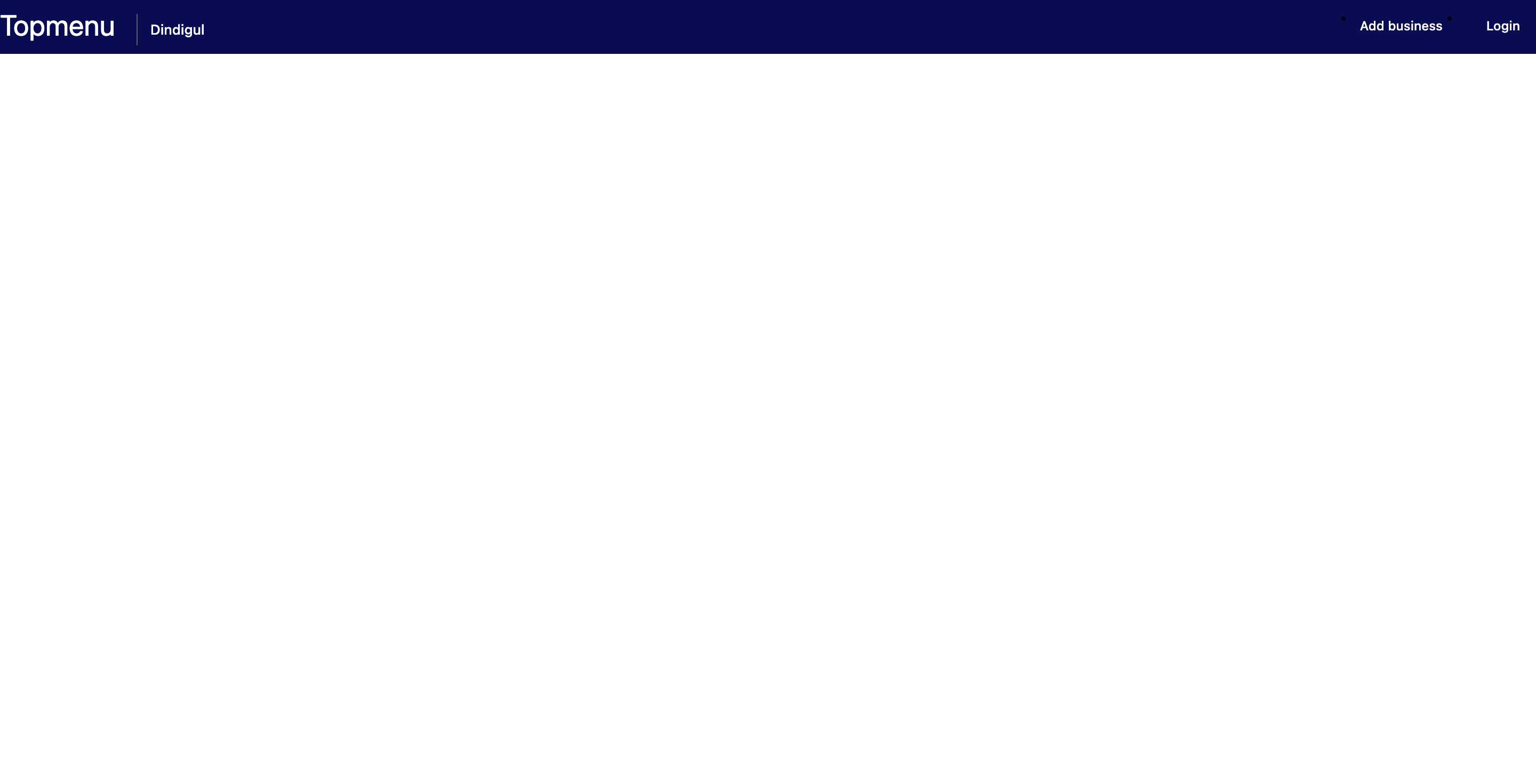
First, let's create the basic HTML structure for our menu.
Save as index.html
<!DOCTYPE html>
<html lang="en">
<head>
    <meta charset="UTF-8">
    <meta name="viewport" content="width=device-width, initial-scale=1.0">
    <title>Fixed Top Menu</title>
    <!--<link rel="stylesheet" href="styles.css">-->
    <style type="text/css">
      * {   }
body { /* background: #f0f2f5 !important;  */
    margin: 0;
    font-family: roboto, -apple-system, BlinkMacSystemFont, segoe ui, Roboto, helvetica neue, Arial, sans-serif, apple color emoji, segoe ui emoji, segoe ui symbol, noto color emoji;
    font-size: .85rem;
    font-weight: 400;
    line-height: 1.5;
    font-size: 13px;
}
      /** topmenu **/
.hom-top {  background: #292c2e; }
.hom-top {
    transition: all .5s ease;
    background: #000;
    box-shadow: none;
}
.hom-top {
    transition: all .5s ease;
    padding: 3px 0 7px;
    position: fixed;
    z-index: 20;
    width: 100%;
    background: #090b52;
    /* box-shadow: 0 8px 18px -8px rgba(42, 42, 42, 0.63); */
    transition: all .5s ease;
    top: 0;
    left: 0;
    right: 0;
}
.hom-nav {
    width: 100%;
    float: left;
}
.top-log {
    float: left;
}
.hom-nav .ic-logo {
    width: 200px;
    margin-top: 10px;
}
img {
    -ms-interpolation-mode: bicubic;
    display: inline-block;
    height: auto;
    max-width: 100%;
    vertical-align: middle;
}
.menu {
    margin-right: 20px;
    float: left;
    margin-right: 20px;
    border-left: 1px solid #4f6171;
    padding: 5px 5px 5px 12px;
    margin-left: 20px;
    margin-top: 10px;
    cursor: pointer;
    position: relative;
}
.menu h4 {
    color: #fff;
    font-size: 13px;
    margin: 0;
    font-weight: 500;
}
.top-ser {
    float: left;
    width: 33%;
    padding: 6px 0 0 40px;
}
.hom-nav .bl {
    float: right;
    margin: 0;
    padding-top: 4px;
}
.hom-nav .bl li {
    float: left;
    margin-left: 10px;
    font-weight: 500;
}
.hom-nav .bl li a {
    color: #fff;
    cursor: pointer;
    font-weight: 500;
    font-size: 12px;
    line-height: 49px;
    padding: 5px 6px;
    border-radius: 5px;
    float: left;
    display: inline-block;
    line-height: 24px;
}
.hom-nav .bl li:last-child a {
    color: #fff;
    border-radius: 5px;
    margin-left: 10px;
    padding: 5px 15px;
}
.top-ser {
    float: left;
    width: 33%;
    padding: 6px 0 0 40px;
}
a {
    text-decoration: none !important;
}
.logofont { font-size: 27px; color:#fff; }
.hom-nav .bl li a:hover { color: #fff; }
/**END topmenu **/
      </style>
</head>
<body>
  <section>
  <div class="hom-top">
                  <div class="container">
                      <div class="row">
                          <div class="hom-nav">
                              <a class="top-log logofont">
                                  Topmenu
                              </a>
                              <div class="menu">
                                  <h4>Dindigul</h4>
                              </div>

                              <div class="top-ser">

                              </div>
                              <ul class="bl">
                                  <li>
                                      <a>Add business</a>
                                  </li>
                                  <li>
                                      <a class="btn btn-primary">Login</a>
                                  </li>
                              </ul>

                          </div>
                      </div>
                  </div>
              </div>
              </section>
</body>
</html>

Sign up for free and be the first to get notified about new posts.